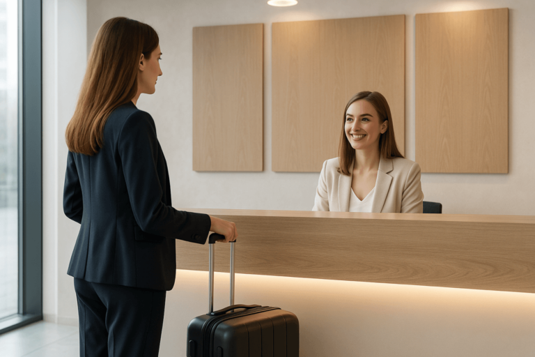
When someone walks into your office, they start judging your business before you say a word. Not because they’re rude. Because that’s how humans work. The first ten seconds set the tone: “professional”, “premium”, “chaotic”, “cold”, “welcoming”, “thrown together”.
And in most commercial spaces, one element carries more weight than any other: the reception desk.
At Welkomst, we design and build custom reception desks for modern workplaces across Denmark and beyond. In this post, I’ll break down what makes a reception area feel high-end, calm, and credible — and how to avoid the design mistakes that quietly cost you trust.
Why the reception desk matters more than you think
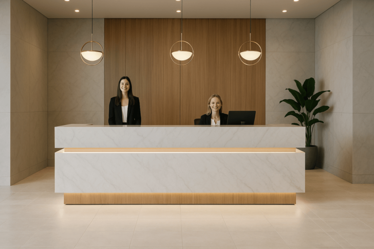
Your reception is your brand in physical form. It’s the first touchpoint for clients, candidates, delivery partners, and sometimes investors. Even if you don’t “do” walk-ins, you still have visitors. And they still form an opinion.
Well-designed reception desks do three jobs at once:
- Signals competence: clean lines, quality materials, and thoughtful detailing communicate that you’re switched on.
- Controls the experience: it guides people where to stand, where to look, and what to do next.
- Makes people feel welcome: comfort and clarity reduce friction, especially in healthcare, legal, finance, property, and professional services.
Search intent is clear too: people regularly look for custom reception desk, reception desk design, modern reception area, and commercial fitout reception ideas. The reason is simple — front-of-house is no longer an afterthought. It’s a competitive edge.
What “premium” reception design actually looks like
Let’s make this concrete. Premium is not gold taps and marble everywhere. Premium is restraint and execution.
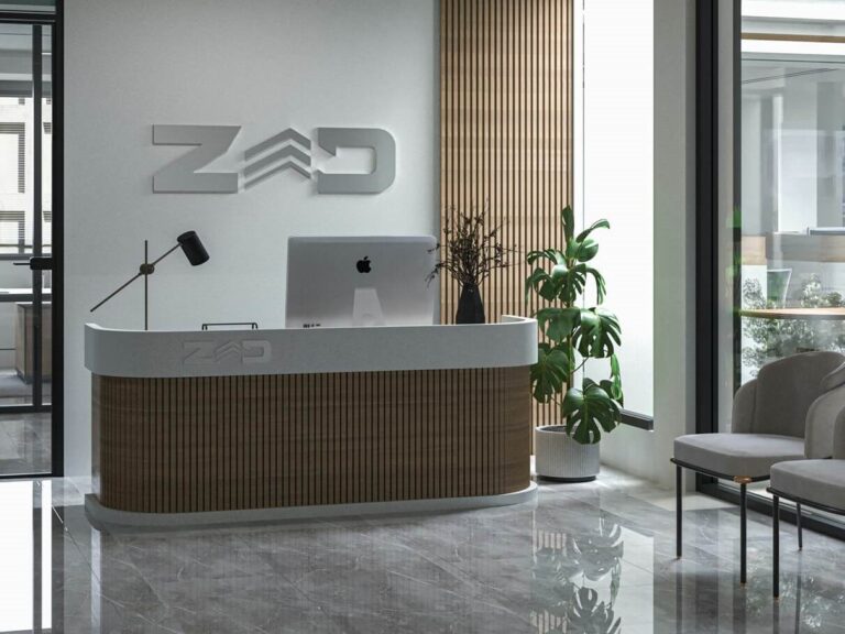
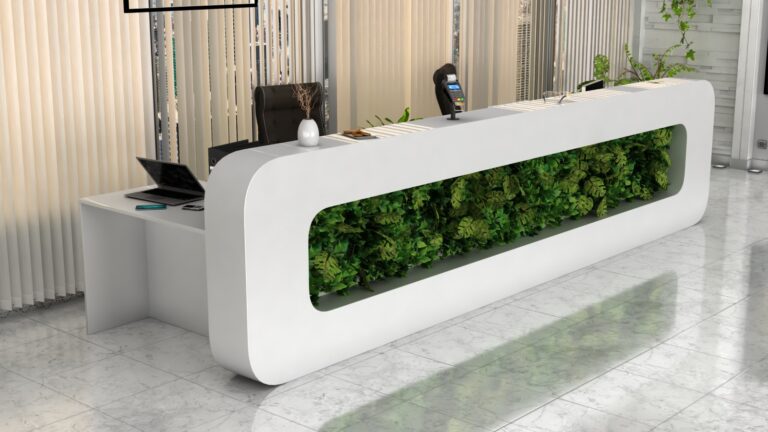
1) Strong geometry, simple silhouette
The best desks are easy to read from five metres away. One clean shape. No visual clutter. No random shelves, angles, and add-ons fighting for attention.
A modern reception desk often uses:
- straight runs with a single return
- a gentle curve (when the space needs softer flow)
- a “floating” front panel or recessed plinth for shadow lines
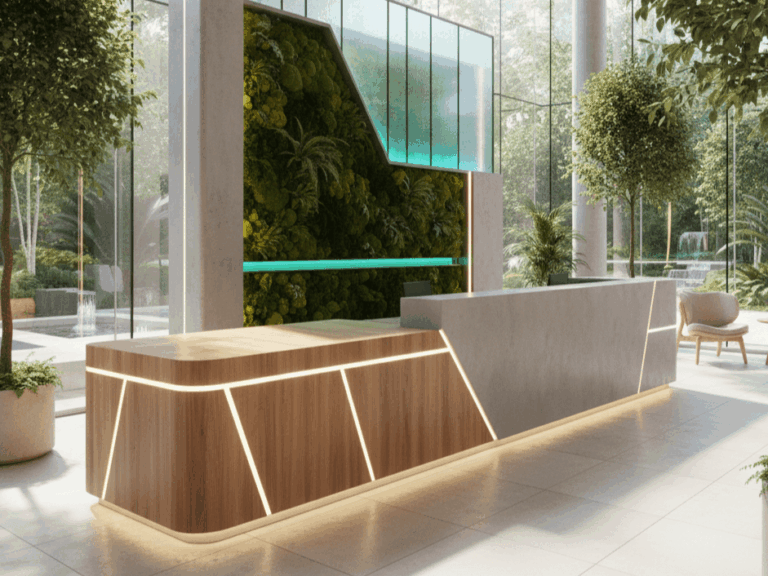
2) Materials that feel good up close
People touch reception desks. They lean on them, put bags on them, sign forms. If it looks nice but feels cheap, you lose the magic instantly.
High-performing combinations:
- timber + stone (warmth + authority)
- Corian / solid surface + timber (clean + tactile)
- microcement / terrazzo + matte lacquer (modern + durable)
A commercial reception desk should also be practical: resistant to scuffs, easy to clean, and built to survive daily use without looking tired in 12 months.
3) Lighting that flatters the space
Reception lighting is a cheat code. Done well, it makes even a modest area feel intentional.
Consider:
- integrated LED under a floating front panel (subtle glow, not nightclub)
- backlit logo panels (soft brand presence)
- warm, controlled colour temperature so faces look human, not grey
Lighting should highlight surfaces and edges, not blow out the room. You want calm.
The usability details most fitouts get wrong
This is where reception design becomes commercial fitout craft, not Pinterest styling.
Height and ergonomics
A desk that looks stunning but forces staff to hunch, twist, or work off a tiny surface is a long-term problem. Split-height designs are common for a reason: standing visitor height on the front, seated working height behind.
Cable management and tech planning
Nothing kills a reception area faster than dangling cables, visible power strips, and a monitor perched like an afterthought. Plan for:
- concealed power + data routes
- ventilation for hardware
- printer storage that’s accessible but hidden
- a sensible spot for POS / touchscreen register if needed
Accessibility and compliance
A modern reception needs at least one accessible interaction point. That can be a lowered section, a side return, or a pull-out surface. It should feel integrated, not like a bolt-on.
Storage that doesn’t ruin the design
Reception teams need storage. The trick is building it invisibly:
- push-to-open cabinets
- hidden bag hooks
- internal shelves for parcels and forms
- lockable drawers for keys and devices
Branding without being cheesy
Your logo doesn’t need to be huge. In fact, subtle branding usually feels more premium.
Good options:
- routed logo detail with shadow line
- backlit mark in a calm tone
- brand colour as a thin reveal or internal lining, not a full front panel
If your brand is minimal, your desk should be minimal. If you’re bold, be bold — but still controlled.
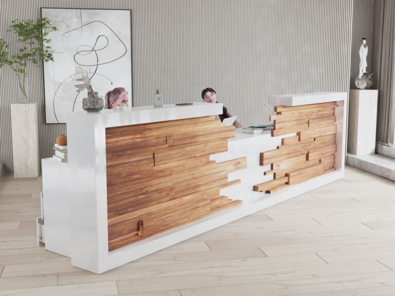
Custom reception desk vs off-the-shelf: the real difference
Off-the-shelf desks are built for “average”. Average space, average workflow, average durability. If you’re investing in a professional fitout, “average” is a waste.
A custom reception desk is designed around:
- your room dimensions and traffic flow
- your brand style and materials palette
- staff workflow and storage needs
- long-term durability and serviceability
It fits. It performs. It looks like it belongs.
What to do next
If you’re planning a new office, clinic, showroom, or refurbishment, start with the reception desk early — not at the end when the budget is tired and decisions are rushed.
A good first step is simple: measure the space, note where people enter, and decide what the reception must do (not just how it should look). Then build the design around that.
Welkomst designs and manufactures bespoke reception desks that balance brand impact with real-world usability. If you want a reception that feels calm, premium, and built to last, that’s exactly the point.